
How to Design a Homepage That Explains Your Business in 3 Seconds
How to Design a Homepage That Explains Your Business in 3 Seconds
A homepage has one job before anything else: help a visitor understand what you do. Studies of online behavior consistently show that people form an impression of a website in a matter of seconds—and if that impression is confusion, they leave. No scrolling, no benefit-seeking, no second chance. They simply click back and try a competitor.
Many businesses lose visitors not because their product is weak, but because their homepage makes people work too hard to understand it. Clever taglines, abstract imagery, and buried explanations create friction. In a market where attention is the scarcest resource, friction is expensive.
This is why designing a homepage that explains your business in three seconds is a strategic priority, not a cosmetic one. A clear homepage builds trust immediately, reduces bounce rates, and turns curiosity into engagement. This guide breaks down how to achieve that clarity deliberately.
What “Explaining Your Business in 3 Seconds” Actually Means
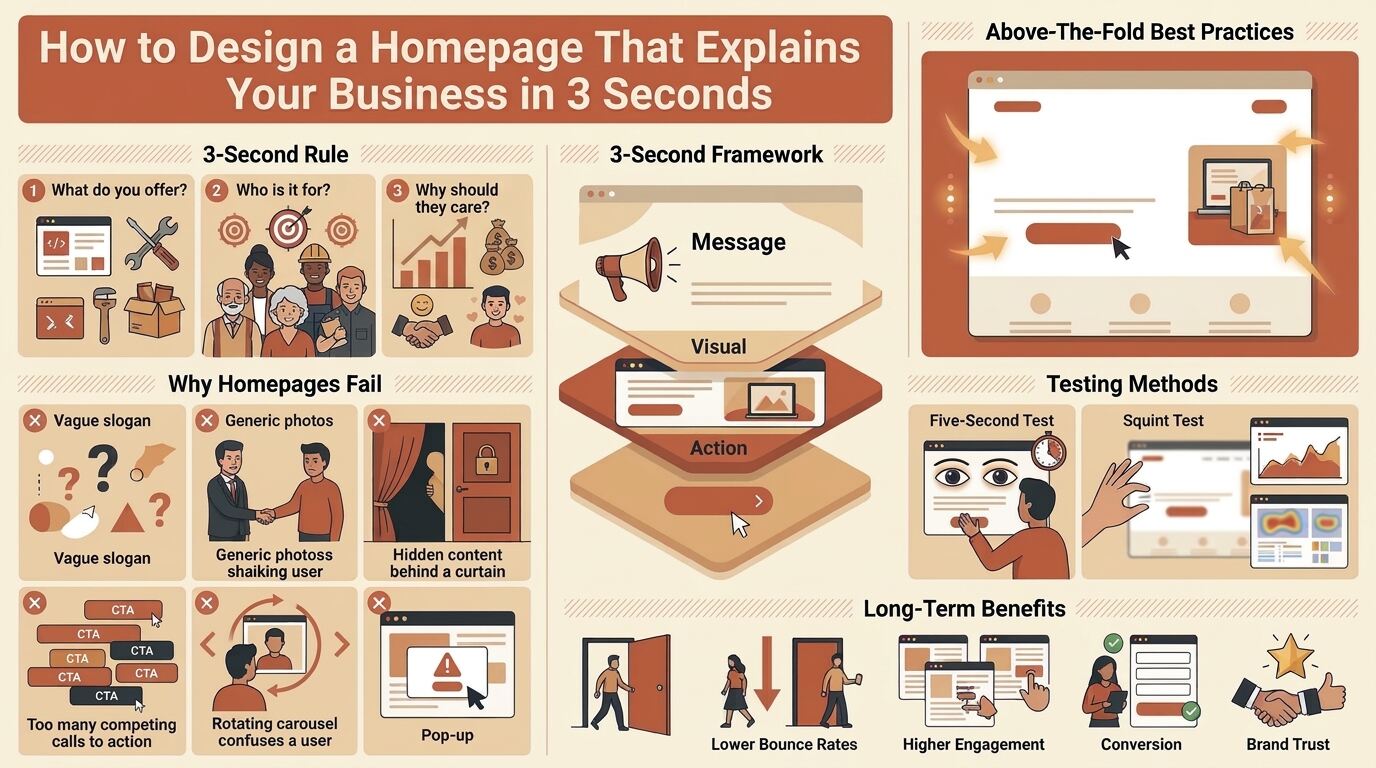
Explaining your business in three seconds does not mean cramming your entire story above the fold. It means answering three fundamental questions almost instantly:
What do you offer? Who is it for? Why should the visitor care?
When a visitor lands on your homepage, their brain is scanning for relevance. If those three questions remain unanswered after a brief glance, the visitor assumes the site is not for them.
The goal is not to impress—it is to orient. A homepage that orients quickly earns the visitor’s attention long enough to tell the deeper story.
Why Most Homepages Fail the Three-Second Test
Not every busy homepage is confusing, and not every minimal homepage is clear. Clarity is about message, not word count.
Some homepages hide their meaning behind vague slogans, stock photography, or industry jargon. Others bury the explanation beneath carousels, pop-ups, and autoplay videos.
Common homepage failures include:
- Headlines that describe a feeling instead of a service
- Hero images that could belong to any company in any industry
- No visible statement of who the customer is
- Calls to action that assume the visitor already understands the offer
- Navigation labels that require interpretation
- Dense paragraphs placed above the fold
These issues may significantly weaken a homepage even if it looks polished and modern.
The Three-Second Framework: Message, Visual, Action
A homepage that explains itself quickly usually follows a simple structure. Think of it as three layers working together.
Message
A plain-language headline that states what you do and for whom. No metaphors, no clever wordplay. If a stranger read only this line, they should be able to describe your business to someone else.
Visual
An image, illustration, or interface preview that reinforces the message rather than competing with it. The visual should confirm the headline, not decorate it.
Action
A single, obvious next step. One primary call to action, phrased in terms the visitor understands, such as “Get a quote,” “Book a demo,” or “Browse plans.”
When these three elements align, visitors understand the business before they consciously decide to keep reading.
Writing a Headline That Does the Heavy Lifting
The headline is the most valuable real estate on your homepage. It should carry most of the explanatory weight.
A strong homepage headline typically includes the service or product and the audience or outcome. For example, “Tree risk assessments for residential and commercial properties” tells a visitor exactly what the business does and who it serves. A weaker version—”Rooted in care, growing with you”—sounds pleasant but explains nothing.
Practical rules for headline writing:
- Lead with the offer, not the brand personality
- Use the words customers actually search for
- Keep it short enough to read in a single glance
- Pair it with one clarifying subheadline, not a paragraph
If the headline needs a supporting paragraph to make sense, it is doing too little work.
Designing the Above-the-Fold Area for Instant Clarity
The above-the-fold area—everything visible before scrolling—is where the three-second judgment happens. It deserves deliberate design attention.
Elements that support fast comprehension:
- A clear headline positioned prominently
- A subheadline that adds one specific detail
- A supporting visual that shows the product, service, or result
- A visible primary call to action
- Minimal competing elements such as sliders, pop-ups, or multiple offers
Every additional element in this space divides attention. If a banner, chat widget, cookie notice, and three buttons all compete for the same glance, comprehension drops. Prioritize ruthlessly.
Using Visuals to Reinforce, Not Replace, Your Message
Images are processed faster than text, which makes them powerful—and dangerous. A vague or generic visual forces the visitor to guess, which slows understanding.
Effective homepage visuals do one of three things:
- Show the product or service in use
- Show the outcome or environment the customer cares about
- Show the people or process behind the business
A photo of a certified arborist inspecting a mature tree communicates more than an abstract photo of leaves. The principle applies across industries: the visual should answer the same question the headline answers, in a different mode.
Calls to Action That Match Visitor Readiness
A homepage that explains clearly also directs clearly. After the visitor understands what you do, they need an obvious next step.
Best practices for calls to action:
- Use one primary call to action in the hero area
- Write action-oriented, specific button text
- Avoid vague labels like “Learn more” when a specific action is possible
- Keep secondary actions visually subordinate
The call to action should match the visitor’s stage of awareness. A first-time visitor may be ready to “See how it works,” while a returning visitor may want to “Get a quote.” Serving both without cluttering the hero area requires restraint.
Testing Whether Your Homepage Passes the Three-Second Test
Clarity is measurable. Before assuming your homepage communicates well, test it.
Practical testing methods:
- The five-second test, show the page briefly, then ask what the business does
- The stranger test, ask someone unfamiliar with your company to describe it after a glance
- The squint test, blur the page and check whether the headline and call to action still stand out
- Analytics review, examine bounce rates and scroll depth on the homepage
- Heatmap and session recordings, observe where visitors look and where they leave
These methods reduce guesswork and reveal whether the message lands as intended.
Common Redesign Mistakes That Hurt Clarity
Homepage redesigns often begin with the goal of looking modern and end with reduced clarity. Common missteps include:
- Replacing specific language with abstract brand poetry
- Hiding the offer behind an animated intro or loading screen
- Enlarging imagery while shrinking the headline
- Adding carousels that rotate the message before it is read
- Crowding the hero area with multiple promotions
- Assuming visitors already know the business
Aesthetic improvements are valuable only when they preserve or enhance comprehension.
Long-Term Benefits of a Clear Homepage
Investing in a homepage that explains your business quickly pays dividends beyond first impressions.
Benefits include:
- Lower bounce rates
- Higher engagement with deeper pages
- Better conversion from paid traffic
- Stronger brand trust
- Reduced support inquiries from confused visitors
- Improved search performance through clearer messaging
Clarity compounds. A homepage that orients visitors quickly supports every other marketing effort, from advertising to SEO to word-of-mouth referrals.
Choosing the Right Approach for Your Business
When planning a homepage redesign, consider working with teams or tools that offer:
- User experience design expertise
- Conversion-focused copywriting
- Accessibility-conscious design
- Performance optimization
- Analytics and testing support
- Ongoing iteration based on real visitor behavior
Clear design is not a one-time project. It is a practice of testing, learning, and refining based on how real people behave.
Conclusion
A homepage that explains your business in three seconds is one of the highest-leverage assets a company can build. It answers the visitor’s most basic questions immediately, reduces friction, and earns the attention needed to tell a deeper story. Whether you run a local service business, a software company, or an online store, the principles remain the same: lead with a clear message, reinforce it visually, and guide visitors toward a single obvious action. Combined with regular testing and thoughtful iteration, a clarity-first homepage protects both visitor trust and long-term conversion potential.
FAQs
1. What does it mean to explain a business in three seconds?
It means a visitor can identify what you offer, who it is for, and why it matters after a brief glance at your homepage—without scrolling or reading paragraphs of text.
2. How can I test whether my homepage passes the three-second test?
Use a five-second test with unfamiliar users, review bounce rates and scroll depth, and conduct a squint test to confirm that your headline and call to action stand out even when the page is blurred.
3. Can a visually attractive homepage still be unclear?
Yes. Polished visuals and clever taglines can coexist with confusing messaging. Clarity depends on what the page communicates, not how modern it looks. A beautiful page that requires interpretation will still lose visitors.
4. When should I redesign my homepage?
Consider a redesign when bounce rates are high, when visitors frequently ask basic questions, when your offer has changed, or when testing shows that users cannot describe your business after viewing the page.
5. What happens after I improve my homepage clarity?
After improvements, monitor analytics, run follow-up user tests, and refine based on real behavior. Clarity work is iterative—small adjustments to headlines, visuals, and calls to action often produce measurable gains in engagement and conversion.