
Why Mobile-First Web Design Is Key to Turning Smartphone Traffic into Sales
Why Mobile-First Web Design Is Key to Turning Smartphone Traffic into Sales
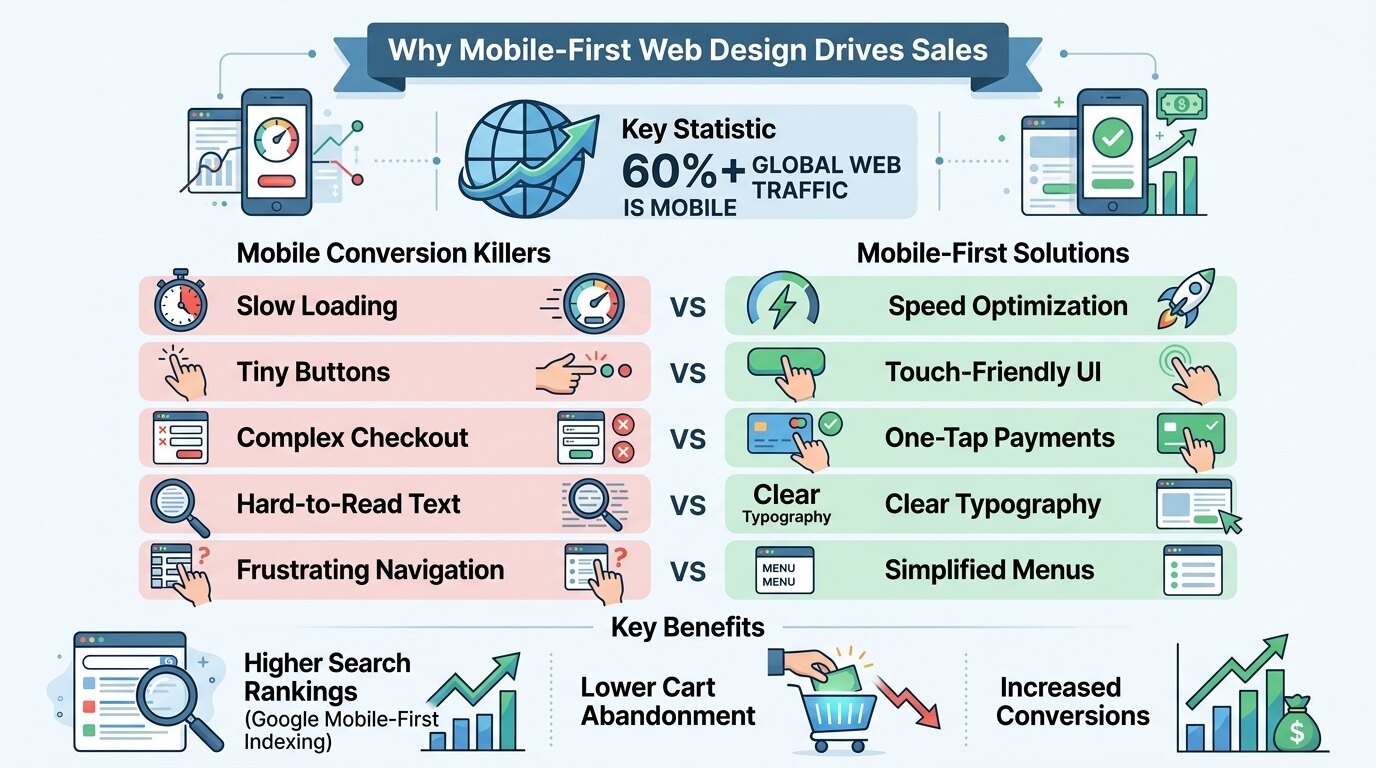
Smartphones are now the primary device for browsing and buying online. Most of your customers see your business through a small screen—and a site that works on desktop but fails on mobile turns away paying customers. Over 60% of global web traffic is mobile, yet many businesses still treat mobile design as an afterthought.
Many lose sales not from poor products but from frustrating mobile experiences—slow loading, hard-to-click buttons, endless scrolling. Modern consumers have zero patience; if they can’t find what they need in seconds, they leave and don’t return.
This is why mobile-first web design protects revenue and ensures a seamless customer journey. It’s not just making a site “fit” a small screen—it’s rethinking the entire user experience for mobile users. A mobile-first approach catches usability issues before they kill conversions, allowing preventive action through responsive design, speed optimization, and touch-friendly navigation.
What Is Mobile-First Web Design?
Mobile-first web design prioritizes the mobile experience before designing for desktop or tablet. Unlike traditional design, which starts with desktop and scales down, mobile-first starts with the smallest screen and scales up. This ensures the most important elements—content, calls to action, and navigation—are optimized for the device most people use.
During the design process, developers and UX specialists examine various factors, including:
- Screen size and resolution
- Touch target sizes (buttons and links)
- Navigation simplicity
- Content hierarchy
- Loading speed on cellular networks
- Font legibility
- Form input methods
- Vertical scrolling behavior
- Thumb reach zones
- Orientation changes (portrait vs. landscape)
The goal is to determine whether a website provides a frictionless experience for users on the go, ensuring they can find information or complete a purchase without frustration.
Why Mobile-First Design Is Important
Not every site that looks good on a laptop works on a phone. Many are designed for desktop then “squeezed” to fit mobile, causing tiny text, overlapping elements, and untappable buttons.
Some issues stay hidden until real smartphone users hit them. What looks fine in a desktop simulator can be a nightmare on an actual phone with a slow connection and a distracted user.
Regular mobile-first design helps business owners:
- Capture the growing mobile audience
- Prevent high bounce rates
- Reduce cart abandonment
- Improve search engine rankings
- Enhance user satisfaction
- Increase conversion rates
- Build brand trust and credibility
- Stay ahead of competitors
Early adoption of mobile-first principles often prevents costly redesigns and lost revenue. Google’s mobile-first indexing means that the mobile version of your website is now the primary version Google uses for ranking and indexing.
Identifying Hidden Mobile Conversion Killers
Professional UX audits can identify problems that are difficult to detect without proper testing. Many of these issues are invisible to business owners who primarily browse their own websites on a desktop computer.
Common hidden hazards include:
- Tiny clickable buttons
- Pop-ups that cover the screen
- Horizontal scrolling requirements
- Slow image loading
- Non-responsive forms
- Flash-based content (unplayable on mobile)
- Text that requires zooming
- Intrusive interstitials
- Auto-playing videos with sound
- Complex navigation menus
These issues may significantly weaken your sales funnel even if the website looks modern on a desktop. For example, a beautiful homepage with a stunning hero image might take ten seconds to load on a 4G connection because the image was not compressed. A user who waits three seconds and sees nothing will leave.
Protecting User Experience and Sales
E-commerce and service websites growing their mobile traffic require regular monitoring. The mobile landscape is constantly changing with new devices, operating systems, and user expectations.
Without proper mobile optimization, poor design may cause:
- High bounce rates
- Abandoned shopping carts
- Frustrated users
- Lost leads
- Negative brand perception
- Reduced repeat business
- Lower average order value
- Increased customer service inquiries
Professional mobile-first design helps reduce these risks by recommending appropriate UX improvements before customers leave the site.
Supporting Healthy Conversion Rates
Mobile-first design is not only about fixing broken layouts. It also helps improve overall business performance by creating a cohesive, enjoyable experience that encourages users to take action.
Specialists may recommend:
- Thumb-friendly navigation
- Accelerated Mobile Pages (AMP)
- Compressed imagery
- Simplified checkout processes
- Click-to-call buttons
- Voice search optimization
- Progressive web apps (PWAs)
- One-tap payment options
A well-designed mobile site is generally faster, more engaging, and more resistant to competitor influence. When users trust your website to work flawlessly on their phone, they are more likely to return, recommend you to others, and complete a purchase.
The Importance of Regular Mobile Maintenance
Routine maintenance works together with mobile-first design to improve long-term sales. A website is not a static product—it requires ongoing care to remain effective.
Services may include:
- Speed testing and optimization
- Security updates
- Broken link checks
- Content updates
- Image optimization
- Browser compatibility checks
- Mobile usability testing
- Analytics review
Regular maintenance reduces unnecessary friction on mobile devices and helps extend the lifespan of your website’s effectiveness. It also ensures that new features and updates do not break the mobile experience that you worked so hard to create.
Why Google Updates Increase Mobile Risks
Google’s algorithms prioritize mobile-friendly websites, and updates can weaken your rankings even when your site design is not immediately changed. The search giant has made it clear that mobile experience is a ranking factor.
Core updates and mobile-first indexing may cause:
- Ranking drops
- Lost organic traffic
- Reduced visibility
- Lower click-through rates
- Increased ad costs
- Decreased conversion rates
- Loss of competitive advantage
A professional SEO and UX audit after major Google updates helps identify hidden issues before your competitors outrank you. Staying proactive is key to maintaining visibility and profitability.
Commercial Websites Benefit from Mobile-First Design
Businesses often have customers browsing from a wide range of mobile devices. The days of designing only for a single screen size are long gone.
Customers browse from:
- Smartphones
- Tablets
- Smartwatches
- Voice assistants
- In-car systems
- Public Wi-Fi hotspots
Regular assessments help business owners reduce bounce rates while maintaining a competitive edge in the market.
When Should a Mobile-First Redesign Be Performed?
Business owners should consider scheduling a redesign or audit when specific warning signs appear. Ignoring these signs can lead to lost sales and a damaged reputation.
Consider a redesign or audit when:
- Traffic reports show high mobile usage
- Bounce rates are higher on mobile
- Sales are lower on mobile vs. desktop
- Navigation feels clunky on a phone
- Google warns of mobile usability issues
- Competitors launch a mobile app
- Your site takes longer than 3 seconds to load on 4G
- Your website is not responsive
Regular audits are especially important for e-commerce stores and lead-generation websites where every conversion counts.
Choosing a Professional Web Design Company
When selecting a web design or development provider, consider companies that offer a comprehensive range of services and a proven track record.
Look for providers that offer:
- Experienced UX/UI designers
- Comprehensive mobile audits
- Responsive development services
- Speed optimization expertise
- SEO integration
- Ongoing maintenance packages
- Proper testing on real devices
- Conversion-focused work practices
Working with experienced professionals helps ensure your website is optimized safely and responsibly for all users.
Conclusion
Mobile-first web design is essential for responsible digital marketing. It uncovers hidden usability hazards, improves user experience, and reduces lost sales.
Whether for e-commerce, service businesses, or corporate sites, regular mobile optimization supports higher conversion rates and stronger customer relationships. Combined with professional SEO, speed optimization, and maintenance when needed, it protects your revenue and brand reputation.
The smartphone is no longer a secondary screen—it’s the primary gateway to your business. Treating it as such is the key to turning traffic into sales.
FAQs
1. What is mobile-first web design?
Mobile-first web design is a professional approach to creating a website that prioritizes the mobile experience before designing for desktop. During the process, specialists ensure that navigation, content, and forms are optimized for touchscreens and smaller screens to maximize conversions.
2. How often should a website be tested for mobile usability?
The testing frequency depends on your traffic, industry, and site complexity. High-traffic e-commerce sites should be tested monthly, while smaller business sites should be audited quarterly or after any major design or Google algorithm update.
3. Can a desktop-friendly website still fail on mobile?
Yes. Some websites may look beautiful on a desktop but hide usability issues on mobile, such as tiny text, overlapping elements, slow loading, or broken forms. A professional mobile-first audit can detect these hidden issues and recommend the best course of action to prevent lost sales.
4. When should I arrange a mobile-first redesign?
You should consider scheduling a redesign if your mobile bounce rate is high, your site loads slowly on 4G, your checkout process is difficult on a phone, or Google has flagged mobile usability issues. Regular audits are also recommended as part of a preventive digital marketing plan.
5. What happens after a mobile-first audit?
After completing the audit, the specialist will explain the condition of your website and recommend suitable solutions. Depending on the findings, this may include layout redesign, speed optimization, navigation improvements, ongoing maintenance, or a full mobile-first rebuild to improve user experience and conversion rates.